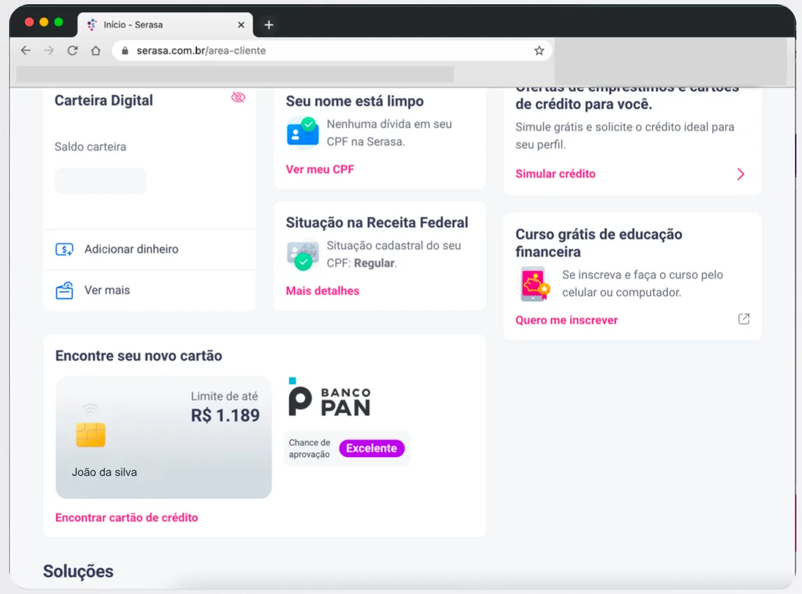
Serasa is Brazil’s largest credit bureau. The card marketplace was stuck at 4% conversion — not for lack of offers, but because the benefits 94% of users were looking for didn’t show up anywhere.
Context
The scenario
In 2020, Serasa displayed a card marketplace as a contextual trigger on the logged-in dashboard — on the Home, in Financial Health, and in My CPF. It offered more than 100 partner cards.
The model was generic: the same card for any profile, any moment, any context.
The problem
The marketplace was stuck at 4% conversion on offer CTR. Research revealed the gap: 94% wanted low annual fees, 92% wanted no annual fee at all, 91% wanted to control spending, 90% were after lower interest rates.
None of those benefits showed up anywhere. The existing card was a lost element, disconnected from the user and the journey.
Research and method
Initial investigation
Desk research across Hotjar, historical decks, and Reclame Aqui. Interviews with 4 key roles — PO, Serasa’s Card Director, Data Analyst. External input shaped the reference model.The structural discovery
The data showed it: nobody could see the attributes that mattered. It wasn’t a naming problem — each benefit simply had no room to breathe in the interface.Validation and journeys
Usability tests validated the 5-element architecture. Beyond the card, we redesigned the partner credit card application journey — previously confusing and complex — and I defined the triggers and in-site application of the Perfil Campeão communication flow.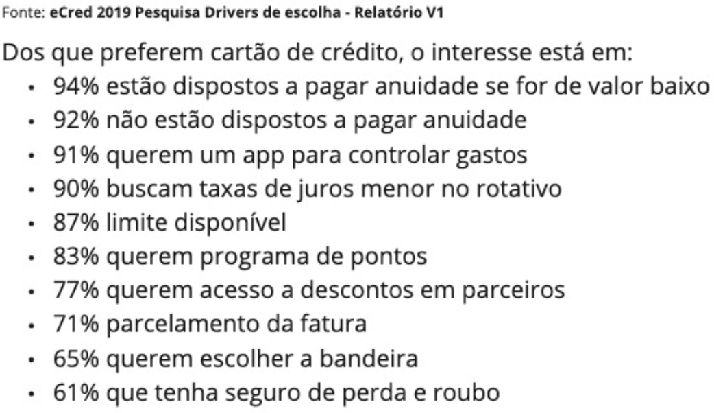
Mapping
The card was reorganized around 5 elements that responded directly to the 94%, 92%, 91%:
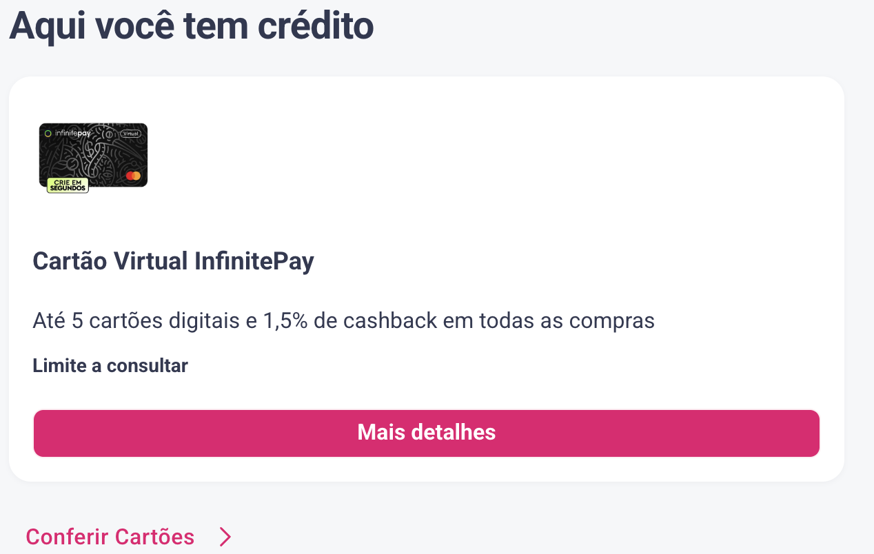
Card name + partner logo for clear identity. Approval odds to remove the uncertainty 91% had. No annual fee answering the 92% directly. Available limit answering the 94%. Contextual CTA that changed based on the user’s moment.
It wasn’t just reorganizing. It was placing each benefit at the right moment in the journey. I planned 3 different contexts — Home, Financial Health, My CPF — because a “pretty card in one place” hadn’t unlocked 4% before; multi-context would.
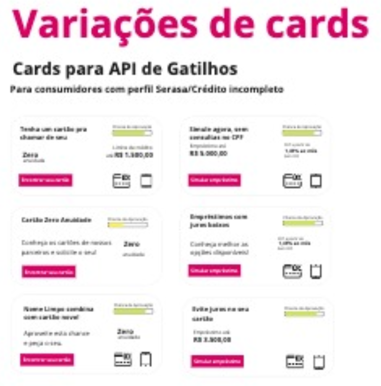
Reality hit: zero annual fee couldn’t go live on the site. Each bank sent partial data and refused to share it with Serasa — so Serasa could only show text without context. Instead of forcing something that didn’t work, I routed the zero-fee benefit to eCred (a card-focused platform) and let the other 4 elements run on the site. It wasn’t the ideal solution. It was the viable one. And viable worked.
Result
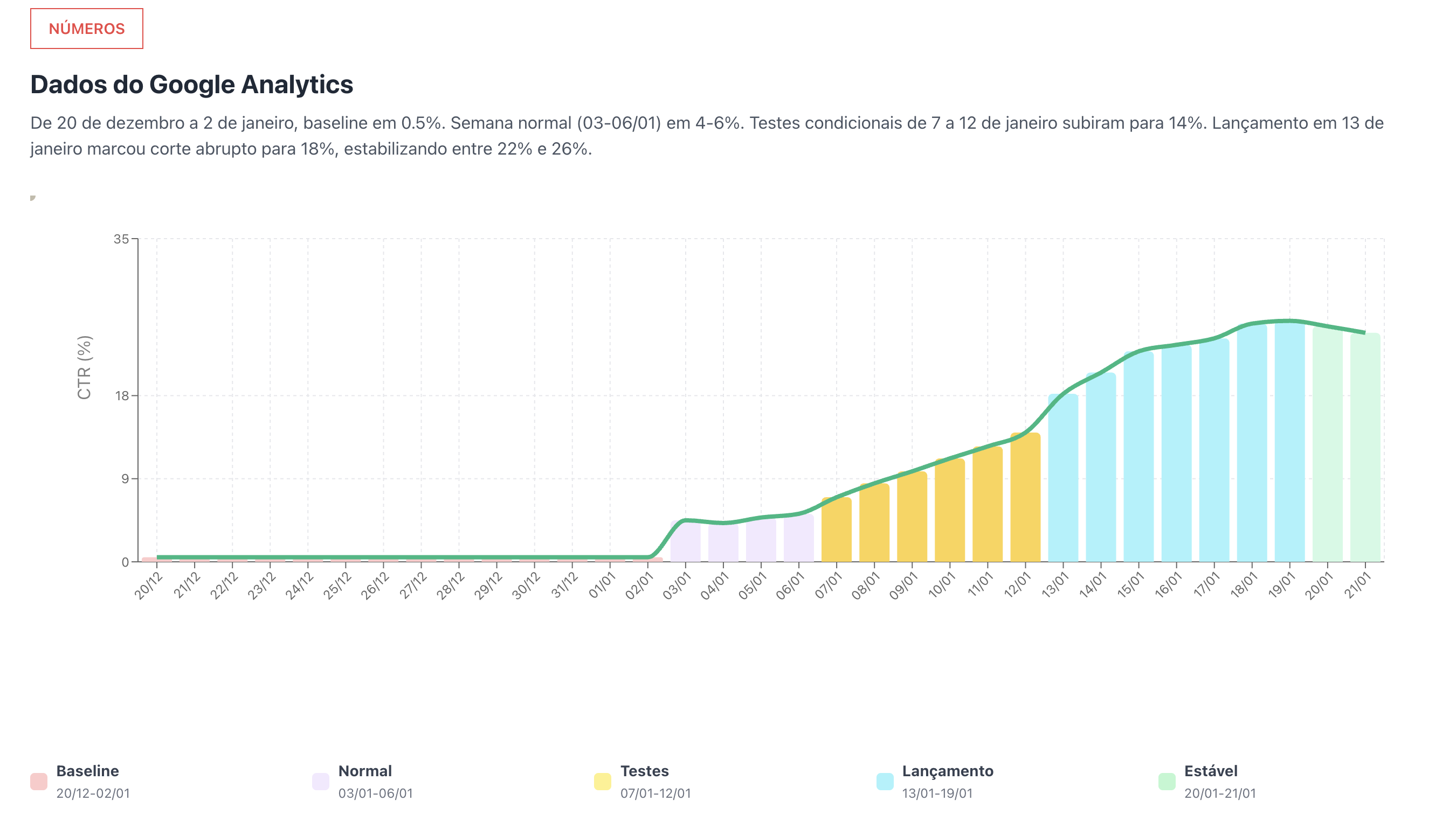
The card launched in January 2021. Conditional tests still in 2020 pushed the daily average to 14%. In January 2021, with the new architecture live, CTR stabilized at 22% weekly average and 26% at peak — more than 5x the original result, even with the technical limitation of no zero-fee offer on the site itself.
Design isn’t about looks. It’s about structure. One element, well architected for 3 different moments, responding directly to what the research said mattered, unlocked 5x more results than a pretty design in a single place.